Why White Clothing Became Part of Cricket’s Visual Language
Why white cricket clothing became part of the game’s visual language, from its early customary use to the distinctive team appearance spectators recognise.
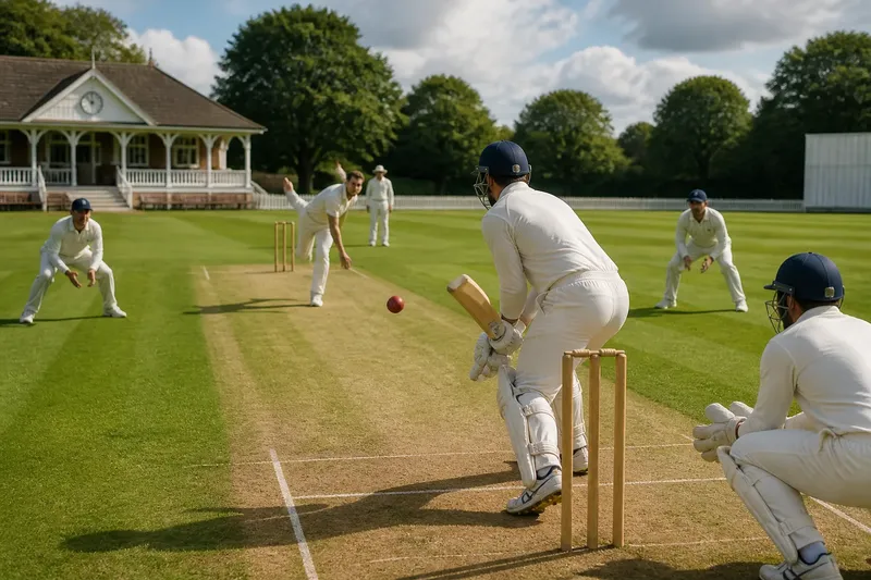
A white shirt turns at the crease as a dark ball travels across the grass. That familiar contrast explains part of why white cricket clothing became part of cricket’s visual language. Its meaning grew through customary dress and repeated use, rather than from one colour rule or a single design decision.
Customary dress became a recognisable cricket look
Cricket whites developed from the clothing worn for outdoor sport in an era before teams had modern, standardised kit. Pale shirts and trousers were familiar choices, and cricket’s organised matches carried those choices onto the field. The broad colour became recognisable even when garments differed in cut, fabric and finish.
There is no single agreed historical explanation for why white took hold. It is more accurate to describe a gradual convention: players wore pale clothing, teams and spectators grew accustomed to it, and the repeated sight linked the colour with cricket. That account explains how the association formed without assigning it to a particular rule or unsupported milestone.
White also makes marks easy to see. Grass stains, clay and sweat show clearly, so the clothing’s changing condition becomes part of the day’s visible record. Keeping whites clean can be inconvenient, but that very contrast makes the difference between fresh kit and a hard-used garment apparent.
Contrast helps define the action on the field
Against green grass, pale clothing gives players a distinct outline as they run, turn or wait at the crease. A dark ball may stand apart from both the field and the players, although lighting, background and ball colour affect what spectators can see.
White kit is like a plain sheet of paper: shapes against it are easy to pick out, but the analogy has limits. Cloud, floodlights, camera settings and the shades behind a player all change the view. White clothing is a visual convention, not a promise of perfect visibility.
The colour also signals a style of cricket. Spectators commonly associate whites with longer, traditional matches, so the clothing can identify the setting before they notice a score or follow the state of play. A whole team in white acts as a recognisable visual cue; one white shirt on its own does not carry the same meaning.
Shared kit makes the team visible as a group
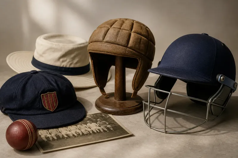
As clubs, schools and touring sides organised their appearance, clothing became a way to show membership as well as meet dress expectations. Matching colour gives players a shared outline, while a badge, cap or sweater trim can distinguish one side from another.
The details need not be identical. Players may add layers for weather, and garments can differ in fabric or fit. The common colour provides the visual link, much as a matching cover makes a set of books look related even when their contents differ.
Imagine a school side preparing for a traditional match. Its existing shirts are white, and the players need to choose between a narrow navy collar and a broad, bright trim. The organiser checks the competition’s clothing rules and lays both options beside the team badge. If the rules permit both, the narrow collar keeps the badge easy to see and gives the shirts a consistent appearance; the bright trim draws attention away from the badge, so the side chooses it only if a more conspicuous team identity matters more than a restrained look. The result is a clear design decision based on the setting, not a claim that one style suits every team.
Small clothing choices can change the overall impression
White clothing often appears with a grass field, boundary rope and pavilion. Together, these familiar features make a scene many viewers associate with traditional cricket. The kit contributes to that impression without defining the game by itself.
Fabric and cut can change while the colour stays familiar. A team choosing garments can check the competition’s dress requirements, consider the conditions in which players will wear the kit, and compare the visible details as a group. For example, if a badge disappears against a shirt’s trim, the team can move it to a clearer position or choose a quieter edge.
Use these observations to make a practical design decision:
- Check the competition rules: If they require plain whites, choose garments without coloured trim; if they permit trim, compare suitable designs before ordering.
- Check the badge against the shirt: If its outline is hard to distinguish, reposition it or select a contrasting backing; if it reads clearly, keep its current placement.
- Check how the shirts look together: If collars or cuffs vary noticeably, standardise those details; if they look consistent, retain the current design.
- Check the clothing in the expected setting: If a detail disappears against the background, choose a more visible permitted detail; if it remains clear, keep it.
- Check the planned layers: If sweaters or jackets cover the badge, place identifying details where they remain visible; if they do not, leave the layout unchanged.
- Check the garment’s stated use: If its fabric or cut does not suit the intended match conditions, compare another option; if it suits them, keep it in consideration.
These checks separate the decisions that often get blurred together: what the competition allows, what identifies the team and what looks coherent on the field.
Why does white clothing signal traditional cricket?
Why do players wear white in traditional cricket?
White became customary through repeated use of pale clothing in cricket, alongside familiar outdoor dress. Its association with traditional matches strengthened as players and spectators saw the same broad appearance over time.
Does white clothing make the ball easier to see?
A pale-clad player, a darker ball and the field can create distinct shapes for a viewer to follow. The result still depends on light, background and ball colour, so white does not make every match equally easy to see.
Are cricket whites made from one standard fabric?
No. Garments can use different fabrics and finishes, and teams can choose them for fit and intended use. The shared white appearance matters more to the traditional look than one material recipe.
Why does cricket white feel formal?
Its association with longer, traditional matches gives the clothing a restrained and familiar appearance. The setting and repeated convention shape that impression, rather than colour alone.
White remains a visual signal, not a fixed uniform
When watching a match, notice how the players’ clothing sits against the field, then look for the details that mark a team: a badge, cap or sweater edge. Those choices show how individual sides can express identity while retaining the shared appearance of cricket whites.
If you are selecting white cricket clothing for a club or school, check the dress rules first, then review the garments together for fit, layering and visible team details. The colour’s meaning comes from its repeated place in cricket; the choices around it determine how clearly a particular team appears within that tradition.